STYLE GUIDE
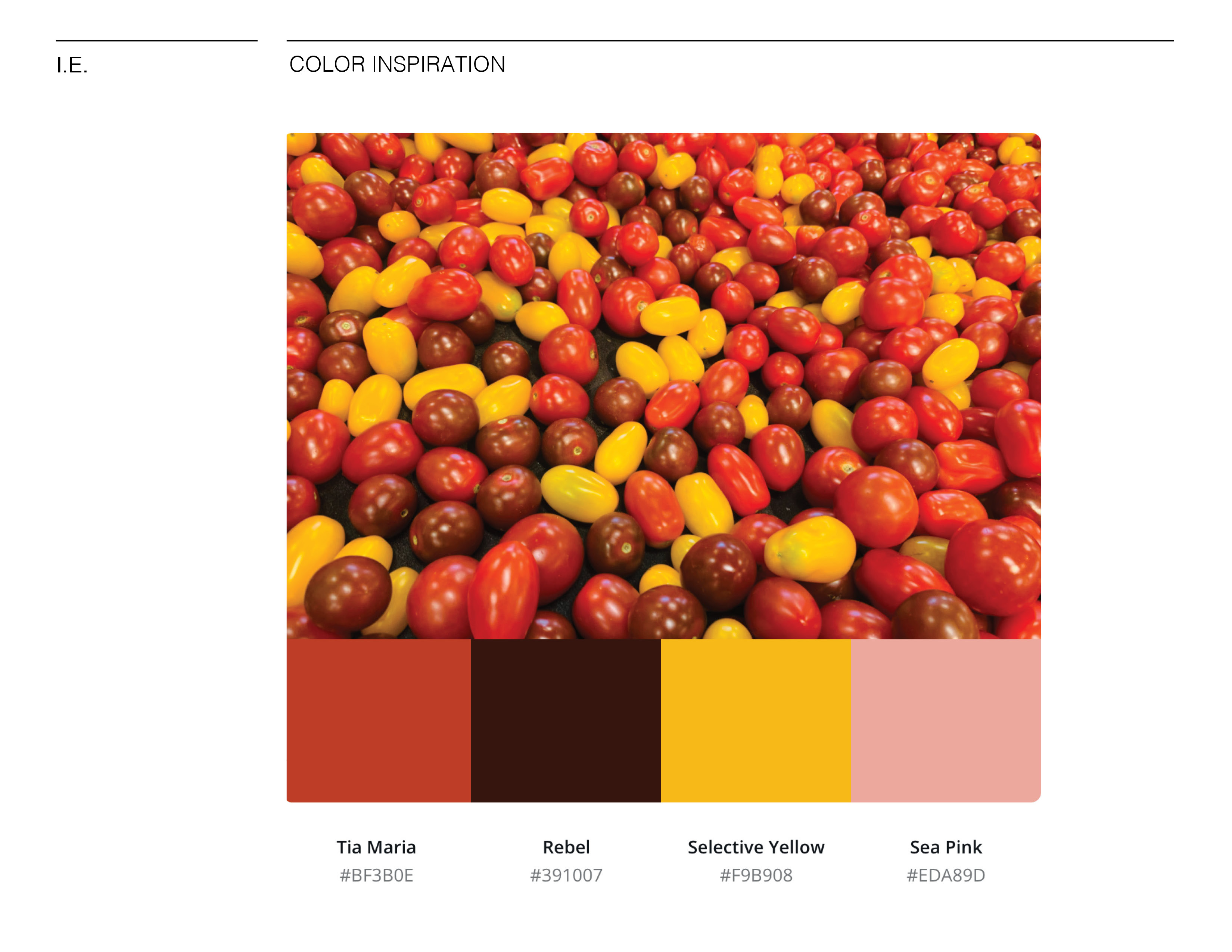
For my final style guide I returned to the color palette that is commonly seen in food applications and food itself. These colors are red, yellow, and green. I went to my local grocery store and took photos of the produce. Afterwards, I placed them into an online color generator for palette inspirations. The second page of the guide is the image of tomatoes that inspired my direction for the rest of the branding.
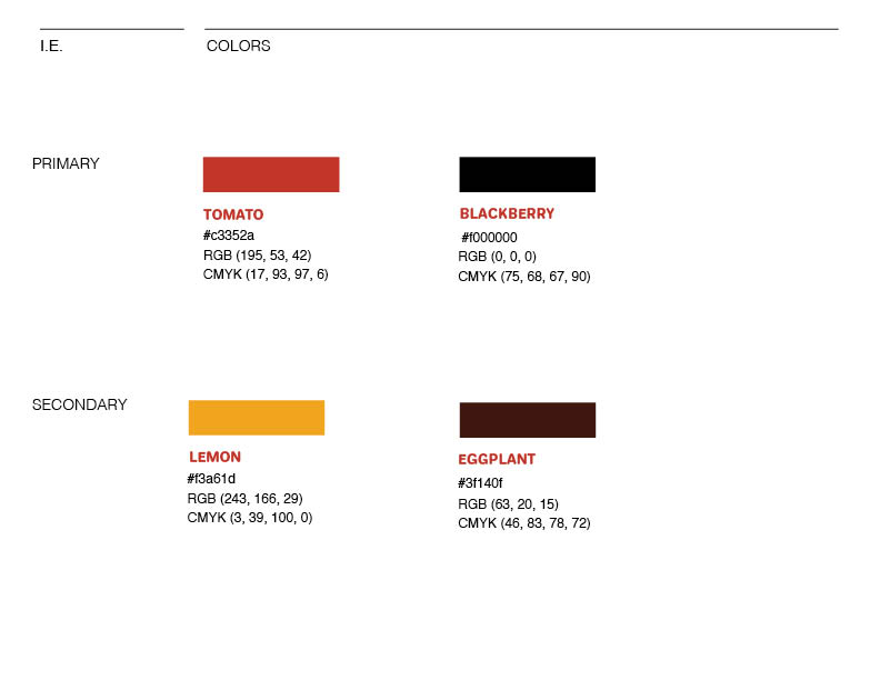
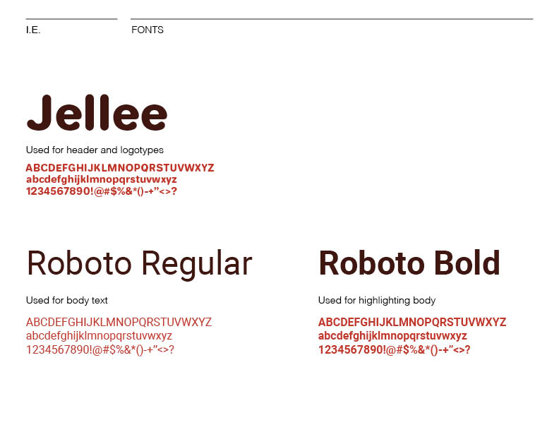
The Ingredient Endeavors style guide includes several important aspects of branding. A cover page, photo that inspired color direction, a color palette with primary and secondary colors, the fonts used in the prototype for logotypes and the body text, as well as the actual logotypes in two colorways.
A couple smaller details regarding the guide are my font choices. Since I wanted Ingredient Endeavors to have a very welcoming feel I had changed my logotype font to be more rounded. The original branding I was working through had type with sharper edges. I also had the goal to keep this prototype very simple and clean looking with the Roboto font. Less is more sometimes!
INFOGRAPHIC
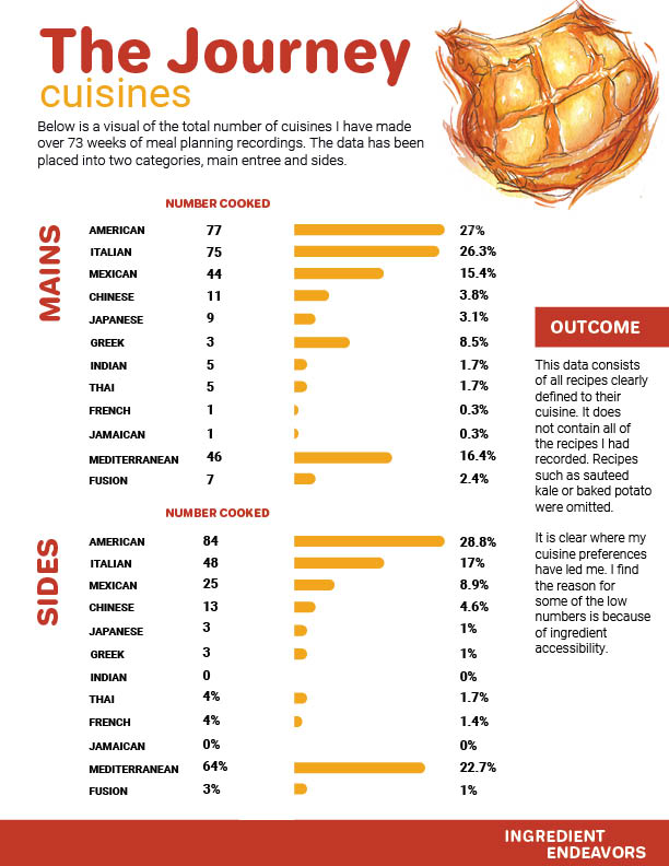
This infographic is based on data I had collected during my journey in 73 weeks of meal planning. It represents the of the number of cuisines repeated over that time in number and percentages. They are separated into two categories, mains and sides.
After completing the infographic I wanted to comment about my findings and provide additional notes. These can be found under the "OUTCOME" section. There is an explanation that I had not included every recipe that I had made during that time, but only ones that I could clearly identify under specific cuisines. Also, I mention the limitations I had on ingredients and how that may have influenced the results. I found it to be quite enlightening!
PROTOTYPE
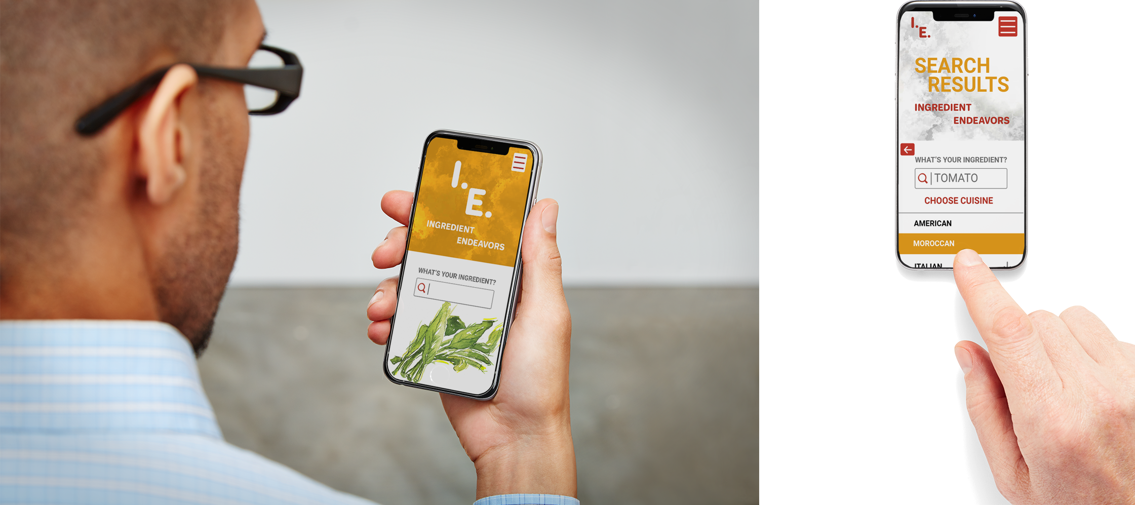
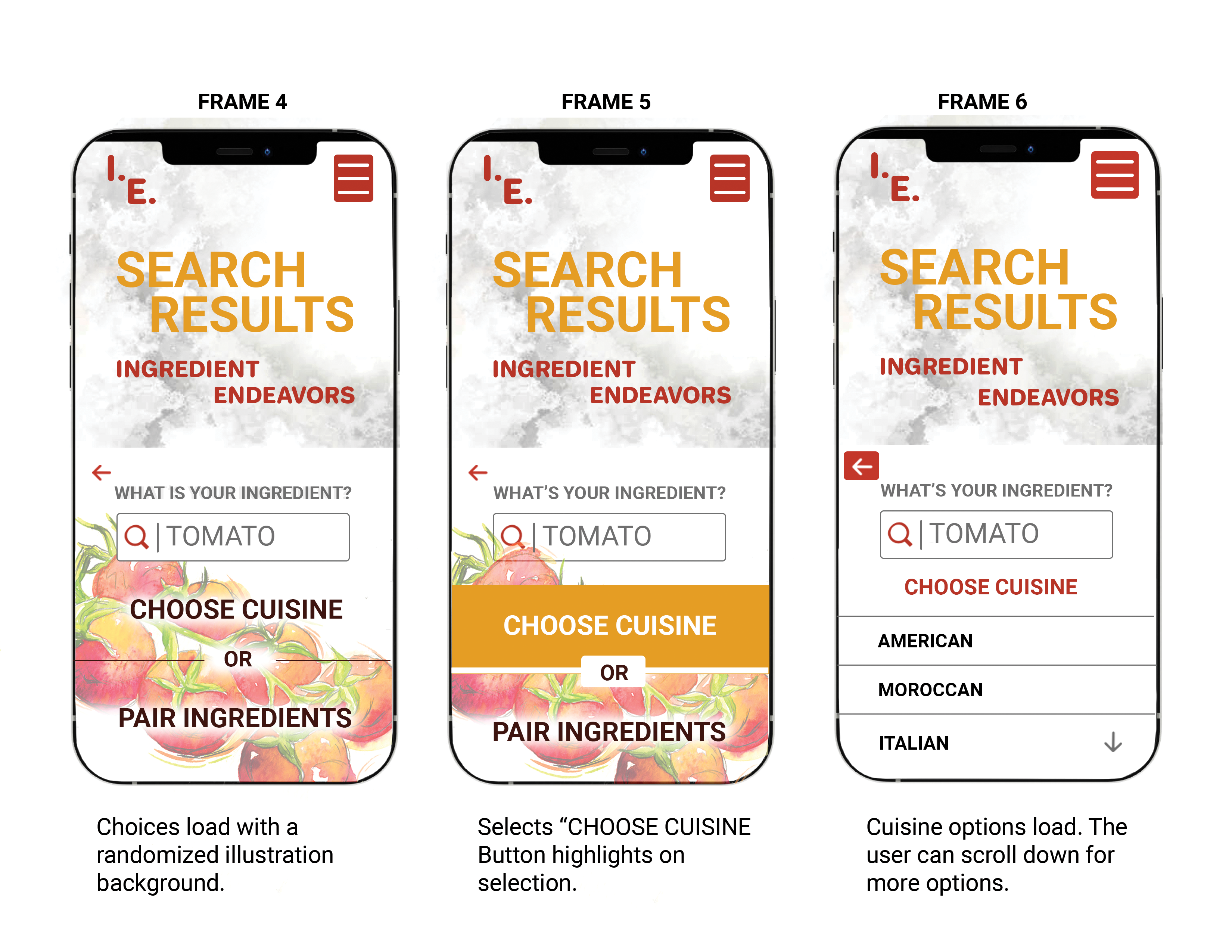
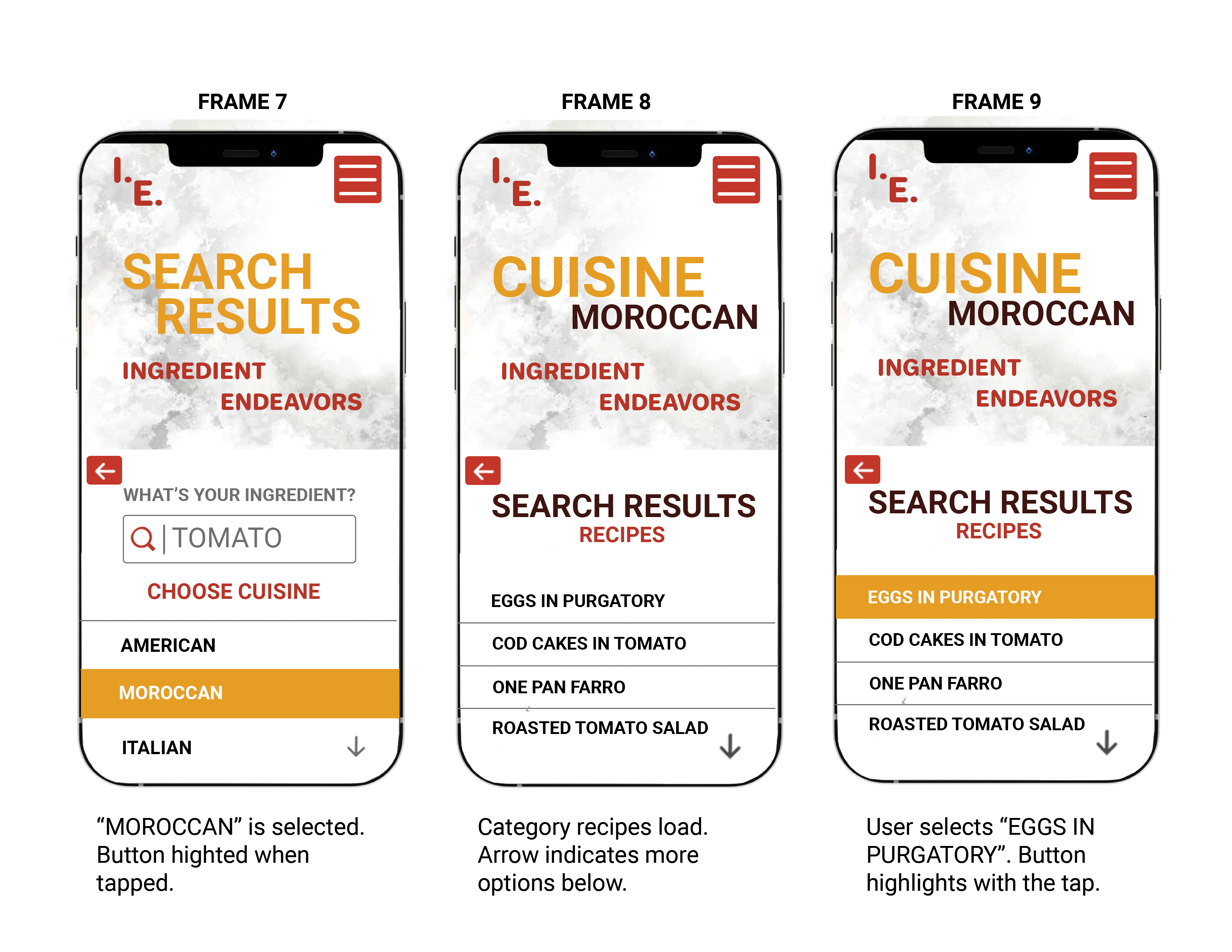
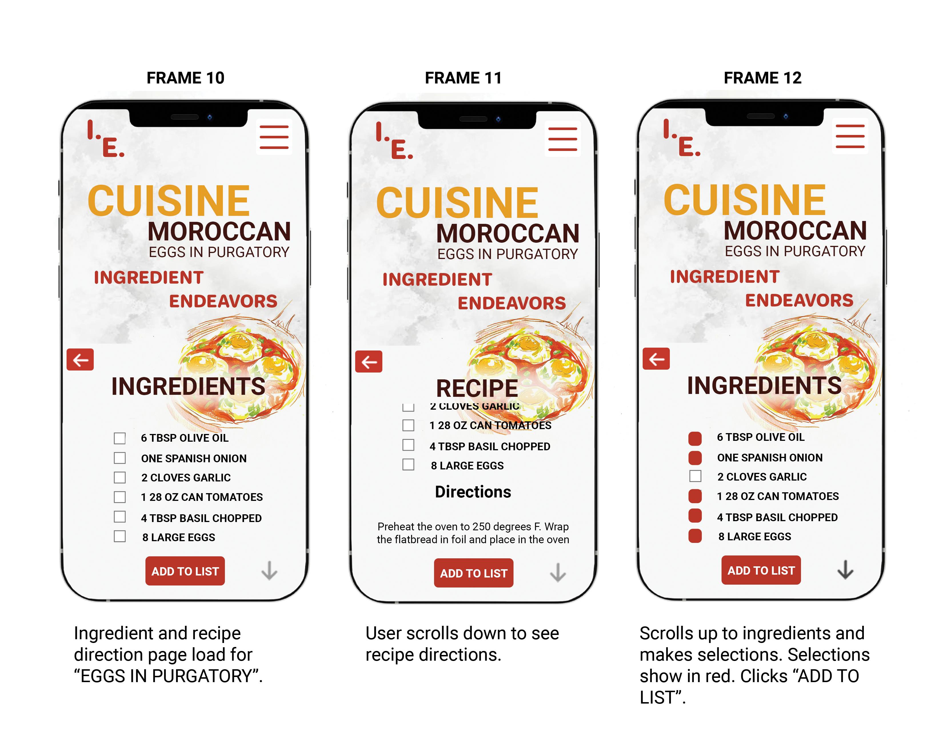
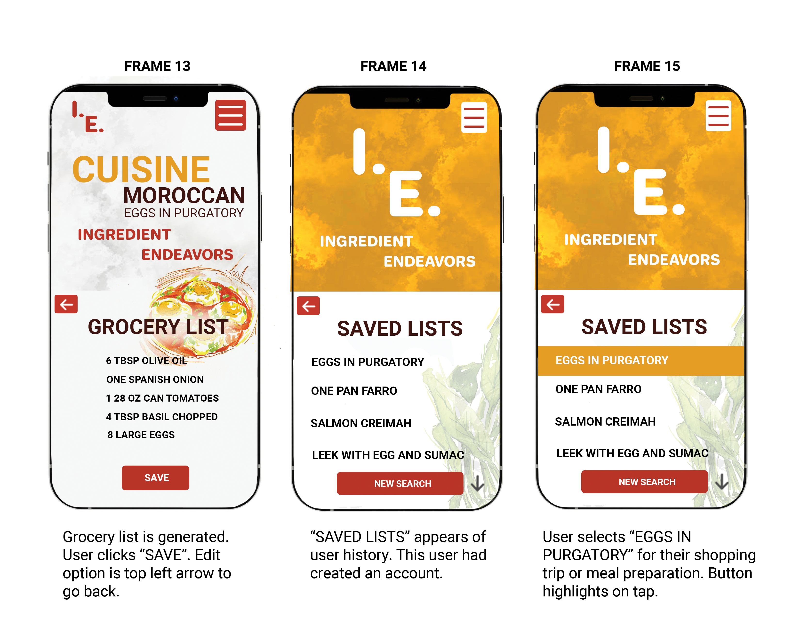
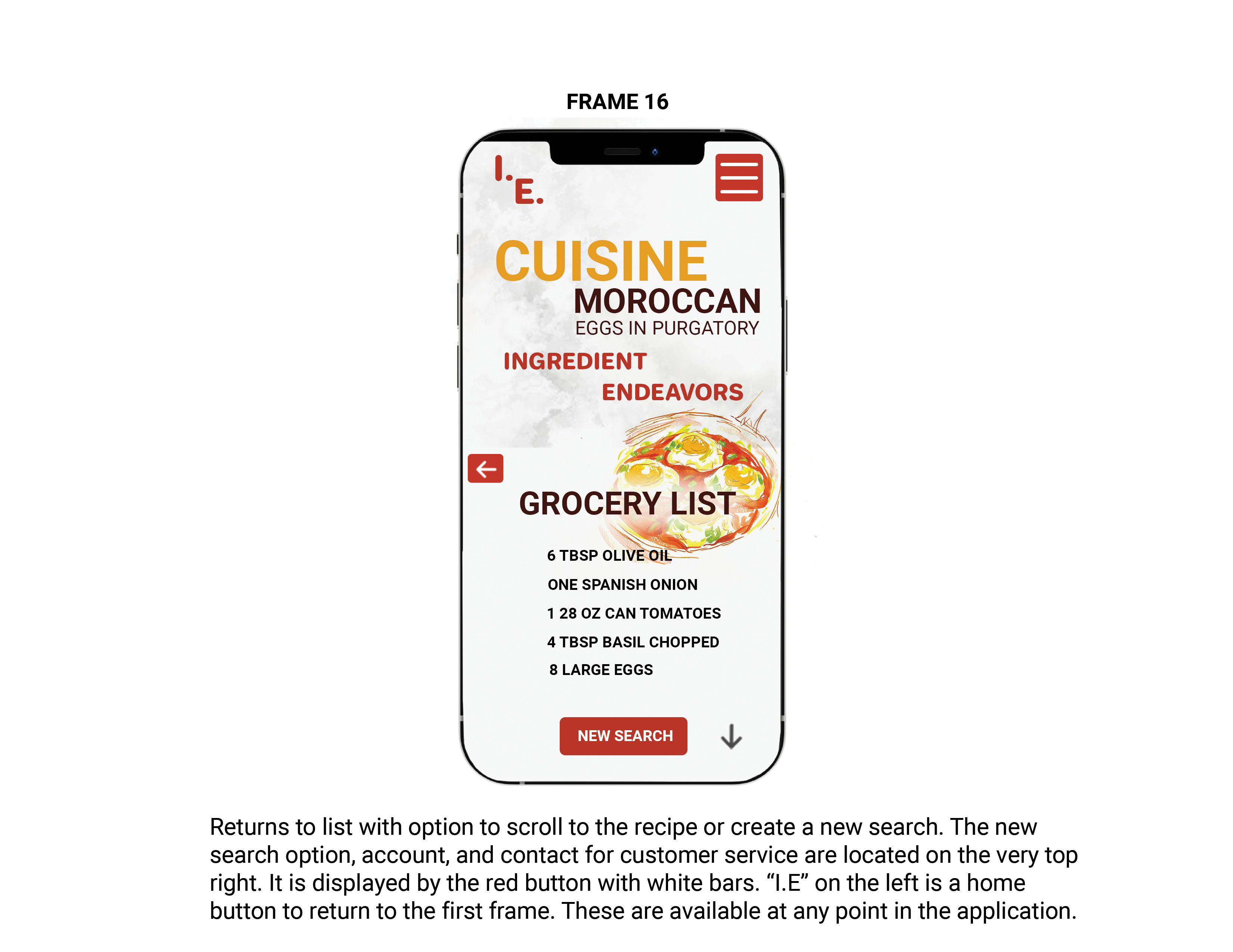
The goal of my final prototype is to demonstrate the task flow of one user's journey. The goal of their task is to search an ingredient they have on hand, select a choice of "choose cuisine" or "pair ingredients", and then narrow to a recipe to create a grocery list from it. This user searches "TOMATO" as their main ingredient. Later they select the cuisine "Moroccan" and continue to narrow their search as they progress through the app.
THE USER JOURNEY
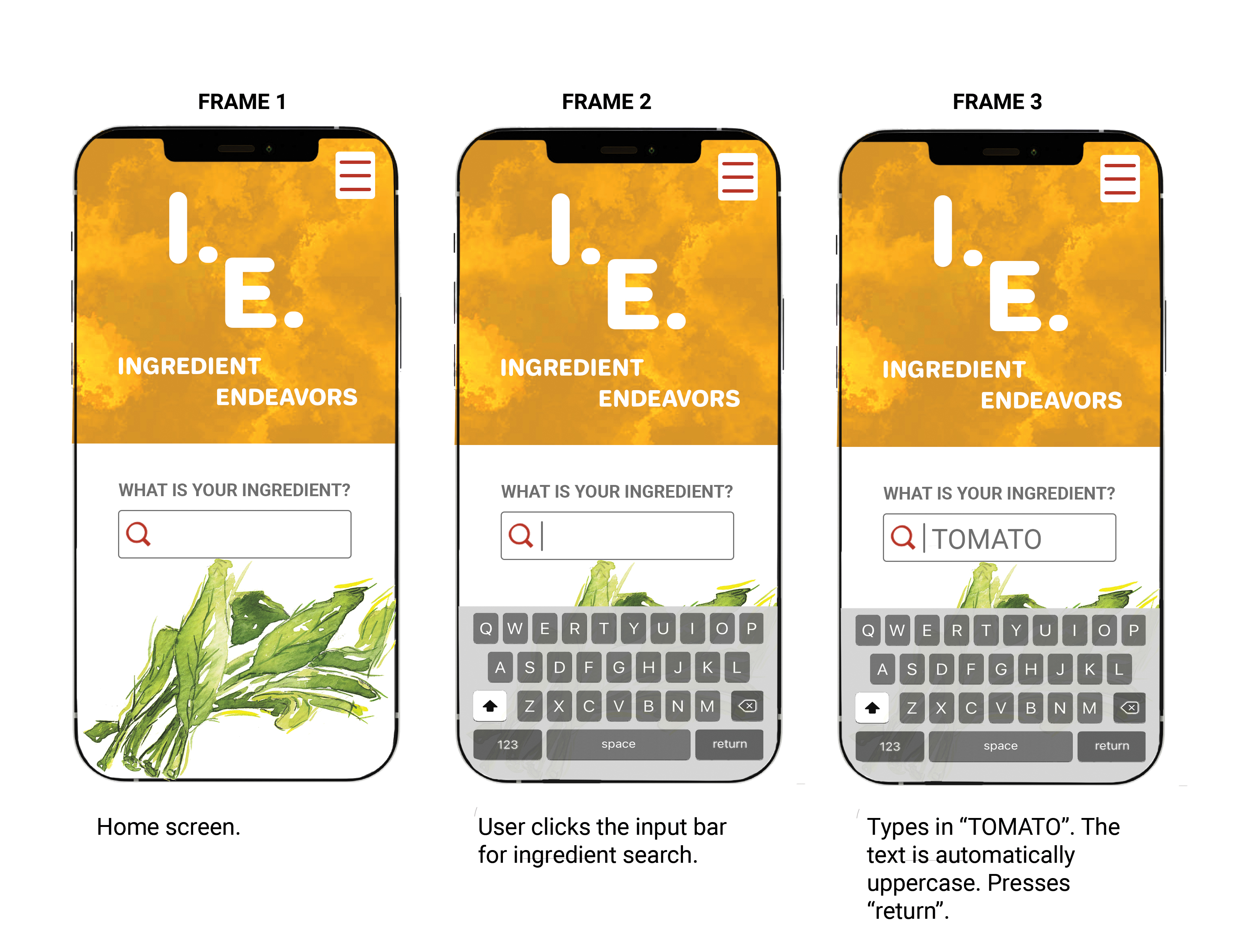
The frames below are labeled left to right for the task direction. You will also notice that below each frame are descriptions of the user's actions. Several buttons highlight in the Ingredient Endeavors.
ILLUSTRATIONS
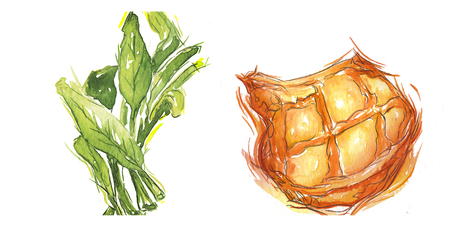
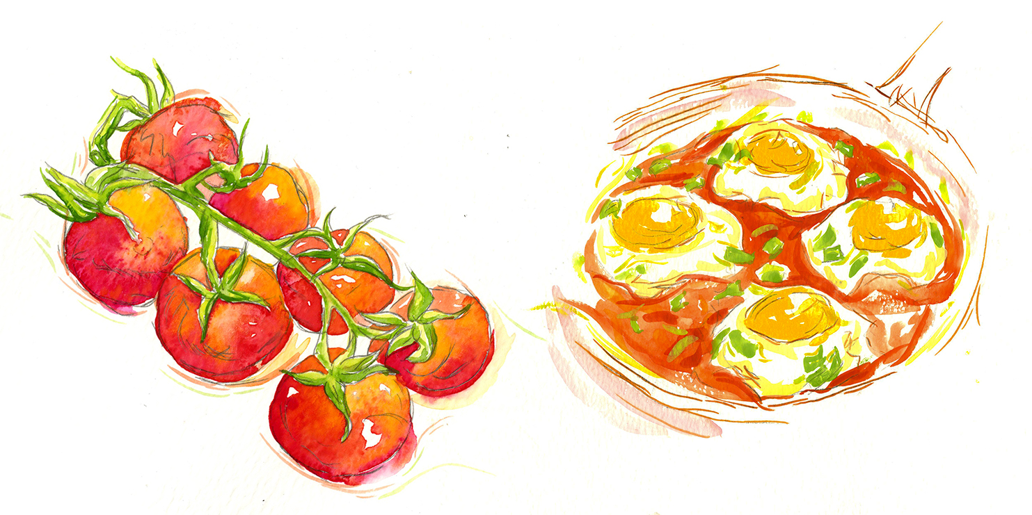
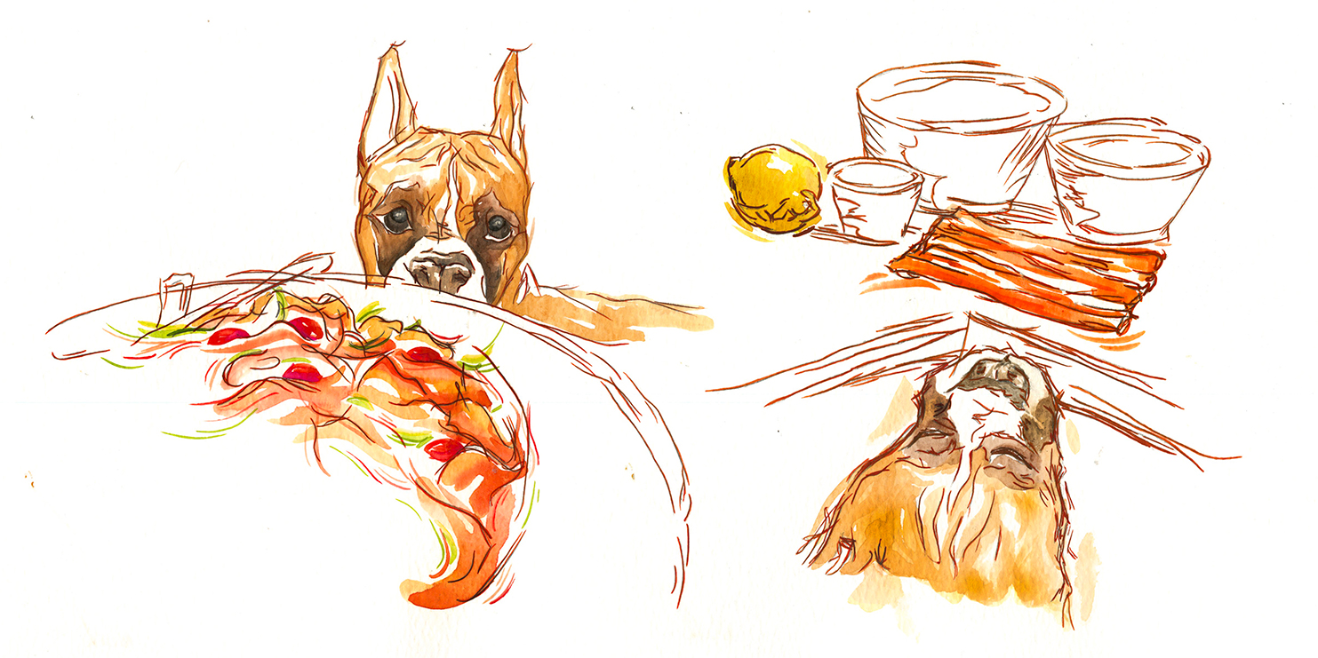
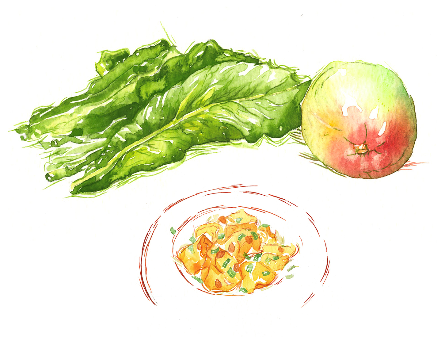
Illustrations are very prominent throughout my prototype due to my background in illustration. I wanted to include them to demonstrate my ability to bring my background of illustration together with both my academic and professional experiences and to demonstrate those disciplines.
I first focused on creating artwork that features the recipes in "Eggs in Purgatory". The recipe is very simple, those ingredients include herbs and tomatoes. I also created an additional illustration of the final meal, a skillet with tomatoes and eggs. Additionally are supplemental illustrations of food items.
